

PPC landing pages are the newest incarnation of an age-old sales problem: How do you keep warm bodies in their seats long enough to hear your message?
PPC landing pages are the newest incarnation of an age-old sales problem: How do you keep warm bodies in their seats long enough to hear your message?
In the digital age, the key is to craft effective PPC landing pages that entice customers to stay, read, and follow the path you’ve carved — a customer journey from curiosity to conversion.

Stick with us as I explain and explore PPC landing pages and the elements that make them work. I’ll then share some great PPC landing pages, examples, and tools you can use to plan, execute, and analyze your PPC campaigns.
Table of Contents
- What is a PPC landing page?
- 5 Elements of a Great PPC Landing Page
- PPC Landing Page Examples
- Tools to Analyze PPC Pages
5 Elements of a Great PPC Landing Page
While there’s so much more to know about landing pages in general, there are five must-have elements in any great PPC landing page, specifically.
Each of these critical elements has an important job to do, and they build on each other to convince the customer to act.
1. Include strong and relevant visuals to grab their attention.
Eyes lead, so you’ll need strong visuals that are directly relevant to:
- Whatever you are selling.
- The wording of the ad you created that led your customer to the landing page.
- Ideally, the wording of your call to action (CTA) as well.
When your audience arrives at your PPC landing page, they should see thematic echoes of the ad they clicked. Strong and relevant images give them confidence that they are in the right place and weren’t swindled into clicking some wayward, spammy link.
Place your hero image near the top of your landing page so it draws attention immediately. If you can, tie the images you choose to your CTA messaging as well.
It’s an added layer of complexity, but when done well it creates a sense of cohesiveness. That way, it feels like every single detail leads to the CTA and contributes to the momentum you are building.
2. Use both a headline and a subheader.
Visitors are soaking in your visuals as they engage your first line of content, so your headline is important and should accomplish the following:
- The headline and hero image must be relevant to one another.
- The words and/or numbers you use in the headline should echo the wording and/or numbers from your advertisement, tying the ad to the landing page in order to start building trust.
- Your headline should include your top keyword, if possible, and work together with the subheadline and visual imagery to establish the style of content to come.
The subheader has three important jobs:
- Transitions content from ad language to CTA language.
- Contains important keywords that may not fit into your headline.
- Establishes the journey of the eyes, leading them downward to the next piece of content.
3. Sell it strategically and with your whole heart.
Your visitor has now transitioned and is ready for more information. Your details should be clear, specific, and really celebrate your product or service.
Organize the valuable aspects of your product into easily digestible chunks that lead from one to the next down the page.
Remember that no matter what you are promoting, it’s about meeting the customers’ needs or giving them a desired experience.
Let them step into the shoes you’re selling, so to speak, by couching the advantages you are offering into contexts your target personas will understand and naturally experience in their lives.
As you wrap up an informational section, write from the perspective of a thoroughly convinced and excited expert. This will lead into the next critical accelerant for your momentum: harnessing the customer perspective.
4. Provide social proof for outside confirmation.
This is the part of your stage show where you’ve done the main ‘song and dance’ and you now tell your audience, “Don’t just take my word for it! Let’s hear from these satisfied customers.”
Inviting feedback from your customers is part of a larger strategy that helps you improve your products, reputation, and marketing strategies.
This is one of the reasons why we collect written reviews, perform surveys, take ratings, etc. You get to use that information to provide social proof of your product’s value and your brand’s trustworthiness.
Testimonials from previous clients are the gold standard, and while written ones are the easiest to get, it’s worth the time and effort to get video testimonials, too.
If you have a lot of good ones to choose from, only put a few of your very best. More than a handful becomes overwhelming, and you can always provide a link to more testimonials to follow if visitors want to see more of them.
5. Create one CTA and repeat it like a mantra.
You want your CTA to be the heartbeat of your page. Your customer only needs to make one decision, and you need to draw their attention to that.
Reduce friction wherever you can so your visitors can ride the wave of your momentum and have good reason to slam that CTA button.
You want to keep your visitor laser focused on that one thing they need to do next. It’s that one ask you are making of them, even if you word it a little differently to entice more than one target persona.
Many landing pages even include a small CTA near the top for those who are already convinced and don’t want to spend a bunch of time on the landing page.
Why? Because customers differ, and that’s okay.
PPC Landing Page Examples
I tracked down some solid examples that make use of all five elements and pointed out where they’ve done an exceptional job.
Corpo Kinetic
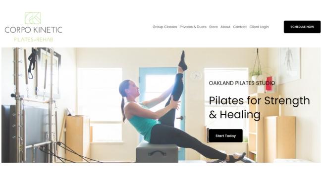
This landing page is a great example of choosing one CTA and letting it be the heartbeat of the page.
What I like about this: Corpo Kinetic uses the same black button over and over, and it stands out on the light background. It’s worded a little differently each time to entice more than one persona, but that button is the beat of the page.
We also see the words Schedule, Start, Join, Learn — and all roads lead to the Booking page, because that is the one action they want to call their customers to.
MTE
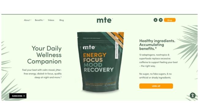
The headline and subheadings taken to the next level.
MTE’s PPC landing page guides the eyes down to the CTA button like reading a book from the top left to the bottom right.
What I like about this: This approach takes advantage of how our eyes were originally trained in childhood when reading. Clever. What else is clever? It creates, in essence, two instances of headline and subheader to get more of their keywords in without looking cluttered.
BestReviews.com
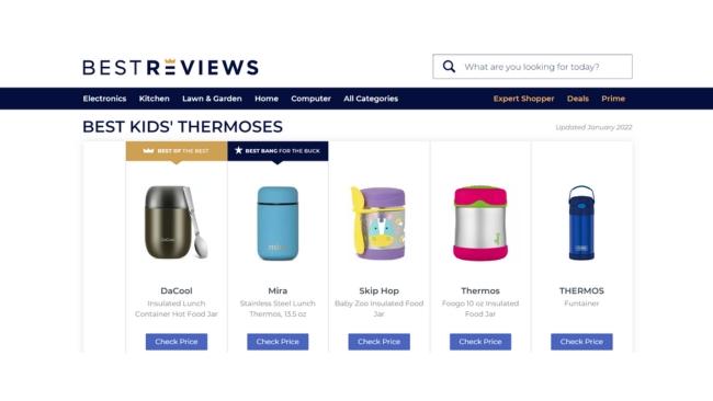
It is hard to articulate how little time and money most parents have, and how refreshing it is to have a landing page take you to the exact information you searched for with no preamble to scroll through.
This landing page is not fancy, but really nailed the visual elements that resonate with their target audience.
What I like about this: The strong visual is front and center, clearly showing what they’ve determined to be the best thermos overall and then the best budget thermos. Then they put a CTA button under each one to check the price and buy it. Boom — done — every busy parent’s dream internet shopping experience.
LeadPages
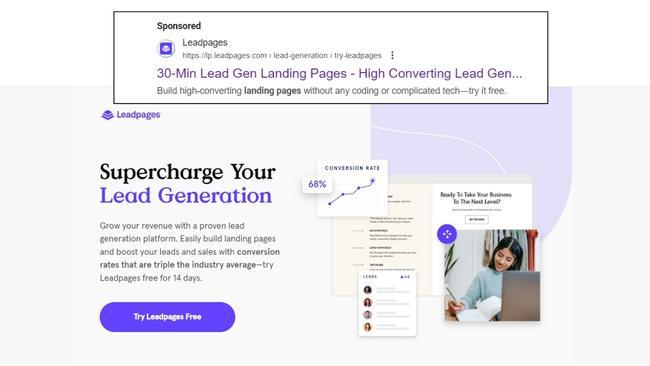
Leadpages does a great overall job with this PPC landing page. The initial ad focuses on conversion, ease, and trying it for free. The landing page subheader hits all three ideas as well to let the visitor know they’re in the right place.
What I like about this: The headline uses an important keyword for them: lead generation. The Try it Free CTA starts in the initial advertisement and continues down the page like a heartbeat to each button.
They include social proof and have eye-grabbing styled images throughout. A landing page creator that practices what it sells — nice work.
Canine Sport Sack
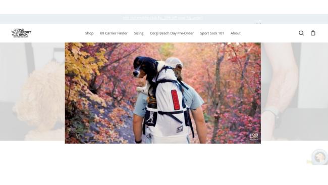
These people know that good-looking dogs can sell just about anything. Canine Sport Sack’s website has clear and colorful visual assets that catch your eye and guide you to an incredibly informative video of how to size the carrier.
What I like about this: It’s clear they start you here because down below they have their products broken down by size. Their sporty orange buttons change color with roll-over, and I’m still thinking about the adorable footer. Sold.
Generation Genius
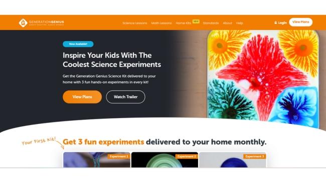
This landing page is a great example in many ways, but in particular of everything outlined in Element 3 (sell strategically and with your whole heart).
They provide photos and videos that let you step into the experiences they are selling before ordering. Valuable aspects of the product are organized in easily digestible chunks that lead from one to the next down the page.
What I like about this: They are really celebrating their product and selling it with their whole heart. Dr. Jeff gives his input as a thoroughly convinced and excited expert, then it rolls right into social proof. Absolutely nailed it.
Havenly
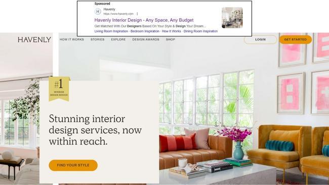
This PPC landing page does a good job of echoing the ad with the the ideas of Get Matched and Get Started, which end up being the heartbeat of buttons down the page. Even the button that doesn’t match — Find Your Style — echoes the advertisement’s Based on Your Style to let you know you’re in the right place.
What I like about this: They matched the images in the top slider not just to the service but also chose images that coordinate in both color and cleanliness to the style and content of the page to come.
They also opted to put linked keywords at the bottom of the ad that could scoop up interior design adjacent traffic because they offer related content like Living Room Inspiration.
Rocket Expansion
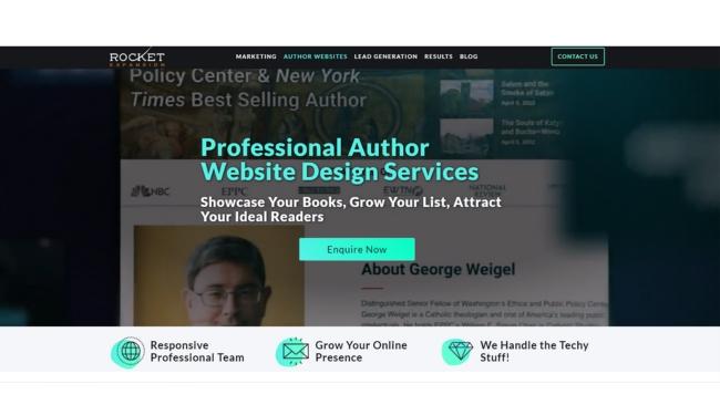
It’s pretty great how Rocket Expansion chose their CTA to sound more literary than normal. What a fun way to entice the persona of authors who want a website. The CTA buttons stand out nicely and repeat Enquire Now all the way down the page.
What I like about this: They start with relevant hero imagery in a background video, demonstrating a service they actually offer. Social proof is there, and examples of their work for both web and mobile look strong and enticing.
Klaviyo
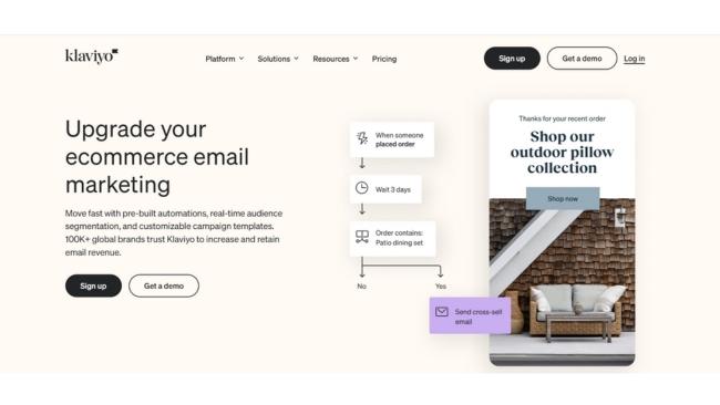
Klaviyo put together an on-trend, minimalist landing page that hits the marks. Clearly a good landing page, yet not the norm — that’s kind of their thing.
One of Klaviyo’s big strategies is actively using social media, which is not that typical of B2B. The phone-shaped images they’ve chosen reflect that and act as an indicator of their style and content to come.
What I like about this: They’ve chosen two CTAs to repeat like a heartbeat together, which isn’t typical, but they both lead to sign ups.
It’s not that different from how Corpo Kinetics’ buttons function, it’s just a different configuration. It makes you wonder what their analytics look like, and if they’re learning anything from it.
Colored Organics
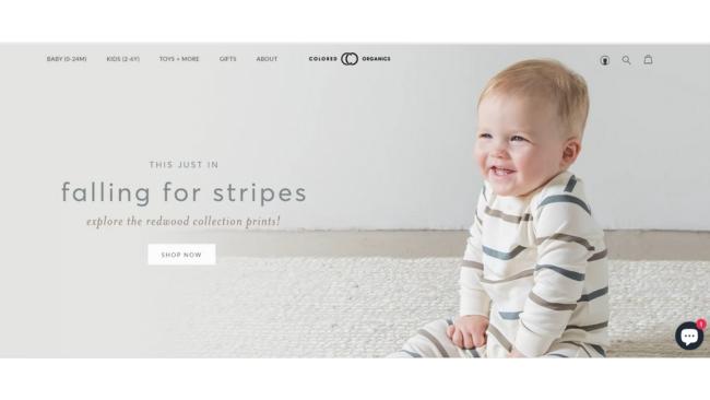
This is a more simplistic PPC landing page than many others on the list, but that’s definitely part of its charm. There’s a surprisingly large selection of baby products tucked behind its Shop CTAs.
What I like about this: Instead of using bold colors and videos to catch your eye at the top, Colored Organics knows that their target audience is going to be enthralled by a smiling baby in a clean space with a cute jumper that visitors will assume is organic, safe, and healthy.
Banana Republic
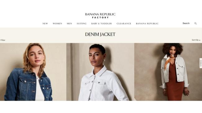
Banana Republic and White House Black Market below deserve kudos for their PPC landing pages. If you’ve ever clicked on retail clothing or department store ads, you can typically expect to be inundated with words and pictures, items, drop menus, and a million chances to leave where you just landed.
What I like about this: Banana Republic leads to the PPC landing page shown above after an original search for denim jacket. That’s a pretty classy place to land compared to companies you might expect to be competing for denim jacket traffic.
They do have drop menus but they are small and unobtrusive — the eye-catching images remain the stars that entice you to scroll down to see more. There you find clean and clear CTA buttons to sign up, sign in, and join.
White House Black Market
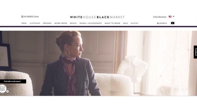
Like Banana Republic, White House Black Market takes its PPC landing pages seriously and makes it clear what to expect from their style and content to come.
WHBM’s ad lands on an enticingly moody video that makes a hero of the idea of light and dark together.
What I like about this: We hear the heartbeat from the buttons down the page that read Shop New Arrivals, Shop Sweaters, and Shop Icons. They want you to get in there and take a look, but won’t be brash or gaudy about it. They’re elevating it and standing apart from the fray.
Home Chef
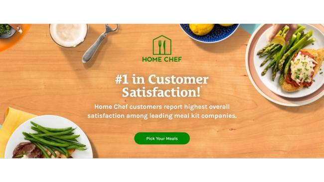
Here’s a good example of hitting the marks while keeping it tight and concise. Home Chef focuses on meals in the ad, in the subheader, and the CTAs.
What I like about this: They’ve chosen punchy, yummy imagery of food that is relevant, flavorful, and health-conscious. Their info sections are small but present and lead you down the page like they should.
Volvo’s Electric Vehicle
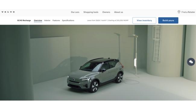
There is some hot PPC ad competition between Toyota, Tesla, Nissan, and Volvo right now on a search for electric vehicles. Toyota wins for selling with their whole heart and invoking a healthier planet.
However, Volvo is selling the heck out of their designs and features on their landing page. Did you see those wheels? They look like wind turbines — what a fun idea.
What I like about this: Volvo’s landing page does a solid job of focusing their style and content on futurism. You see cleanliness, technology, efficiency. Their information sections are cleanly batched down the page. CTA buttons read Build Yours to make it personal, and there’s something pretty special at the bottom.
They actually ask visitors what they think of the landing page. Perhaps they’re getting insights that help them edge out the competitors by simply asking.
Litter Robot by Whisker (Kind of)
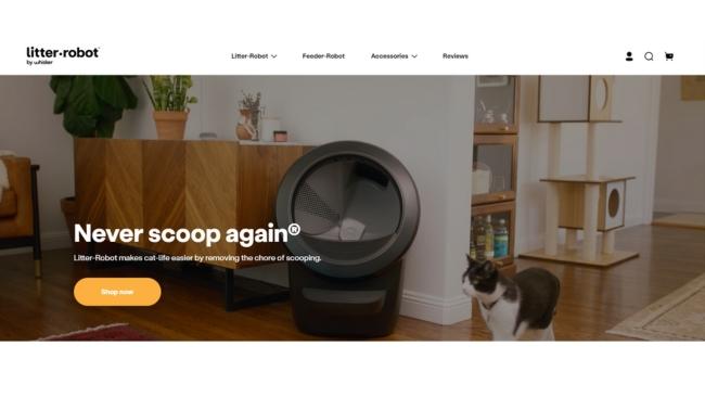
So close, Litter Robot! This one deserved to make the list. Their PPC ad led to a product page that makes sense if you know what the product is already, but isn’t in line with PPC landing page practices.
However, if it linked to something like their homepage instead — pictured above — it’d be knocking best practices out of the park. They could even keep the same PPC ad because it already mentions never scooping again.
What I like about this: It’s beautiful and ticks every box:
- Relevant and eye-catching images including an opening video
- Headline that echoes the PPC ad and an enticing subheader that leads toward the CTA
- They sell with their whole heart, are clearly excited about their product, and sections of information are neatly contained in boxes that lead down the page to…
- Social proof in the forms of videos, readable content, and big-name endorsements
- Obvious CTA buttons down the page — a heartbeat that repeats Shop Now
Tools to Analyze PPC Landing Pages
Once you’ve put in the work to create a PPC landing page, next you’ll want to do some analysis.
There are a number of tools available to learn how your landing page data stacks up against competitors, A/B test your design, see what’s working and what can be improved, etc.
Here are four I recommend:
1. HubSpot

Pricing: Free
Additional pricing options:
- Starts as low as $20/mo. for CMS Hub Starter
- Free 14 day trial then as low as $360/mo. for CMS Hub Professional
- Free 14 day trial then $1,200/mo. for CMS Hub Enterprise
Features
- Collaborates with Google Ads and Facebook Ads
- Video analytics to understand how visitors interact with video testimonials
- An optimization tab that gives suggestions on how to improve your search engine performance
What I like: All-in-one solutions. HubSpot offers a free CMS and a diverse suite of tools that have been designed to integrate seamlessly. Analytics are available for all products and plans.
2. Google Analytics 4 for Google Ads

Pricing: Free
Features
- Collects both website and app data for analysis
- Uses machine learning to identify and report changes and trends in your data
- Offers direct integrations with several media platforms
Pro Tip: If you have a CMS-hosted website (whether that’s HubSpot, WordPress, Drupal, Shopify, etc.) and are comfortably settled in with your build, you can simply sign up for a free Google Analytics 4 property and connect it via the CMS.
3. Semrush Advertising Research

Pricing
- Pro: $129.95/mo comes with free trial
- Guru: $249.95/mo comes with free trial
- Business: $499.95
- Custom Plans Available: Contact Semrush for details
Features
- Categorizes keywords based on search intent to improve your accuracy
- Shows examples of your competitors’ live ads locally and/or internationally
- Details the emotional triggers used in competitor’s ad copy
- Lists which keywords your competitors are bidding on
Best for: Charts and graphs aficionados. Semrush has a knack for presenting information graphically/visually, enabling users to better understand and act on their analyses.
4. Ahrefs

Pricing: Note: All plans below benefit from 2 months free if paid annually.
- Lite $99/mo.
- Standard $199/mo.
- Advanced $399/mo.
- Enterprise $900/mo.
Features
- New Keyword Clustering function in all plans
- Standard and higher plans include a new portfolio feature that creates an aggregate report to compare your pre-selected targets (domains, subfolders, or URLs)
- Displays broken links and broken backlinks for easier identification and update
Pro Tip: Ahrefs has a lot to offer, and is best used by people who are already familiar with analytics. Meaningfully navigating, interpreting, and making use of the advanced features takes some time, practice, and experience.
Get Started
I’ve covered the what, why, and how — let’s chat about now. Right now you have the foundational information you need to get started.
Create an enticing advertisement that links to a PPC landing page. Create the landing page content using the advice above. Choose and connect a PPC analysis tool to your landing page.
Then, you can iterate the advertisement and/or the PPC landing page and track the results. If your changes work, you’ll see better results. If not, reiterate to find what works best for your product or brand.

![]()


